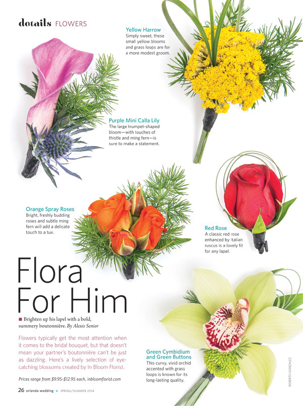
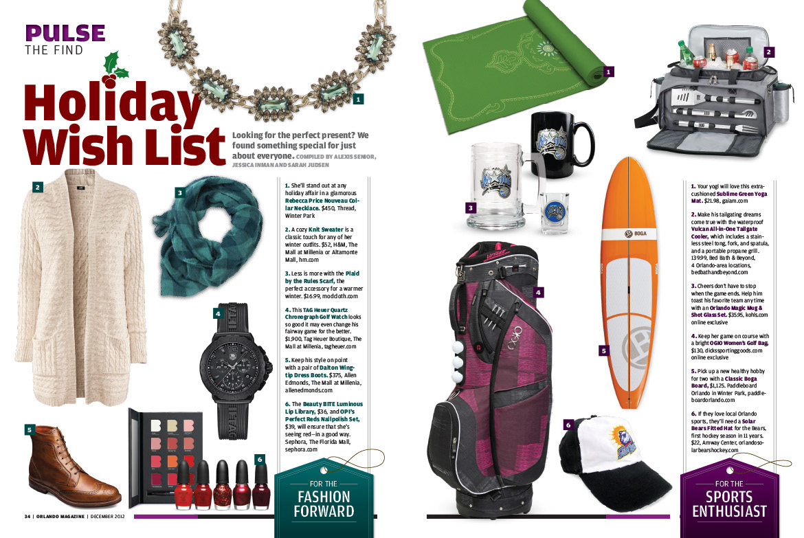
As Art Director of Orlando magazine, I was responsible for overseeing the production of our monthly magazine and supplemental issues for Orlando Wedding and Orlando Home + Garden. The magazine averaged about 136 pages, with some issues topping 200+ pages. The editorial calendar featured themed issues on lifestyle, dining, fashion, and entertainment, and also covered a diverse area of professions, from doctors to lawyers and more.
Below is a small sampling of work done over the course of 5 years, featuring some of my favorite pieces that showcase a range of abilities. Additional examples can be seen in the Publications section.
*This particular issue was published the month I left, but showcase the styles, template, and organization that I implemented.
COVERS
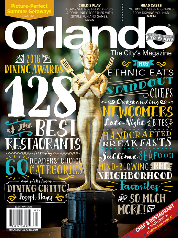
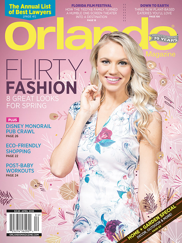
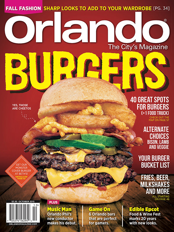
Cover strategy depended on the theme for the issue, but varied in complexity... from outdoor shots, to furry models, to scanning and cutting out 70 years of covers.
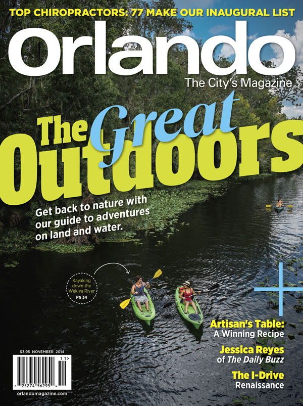
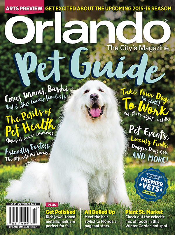
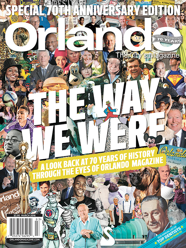
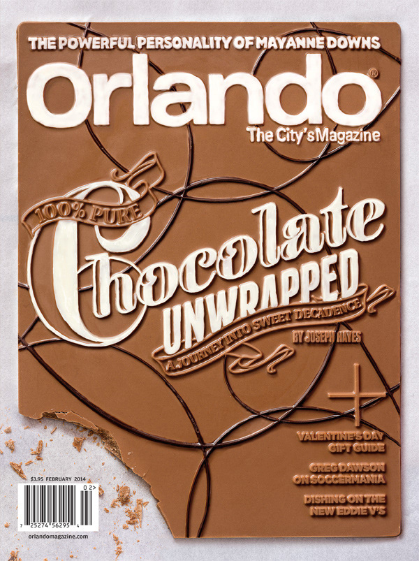
Some of my favorite covers were primarily typographic. Designing a cover purely out of chocolate was a particularly memorable issue early on in my tenure.
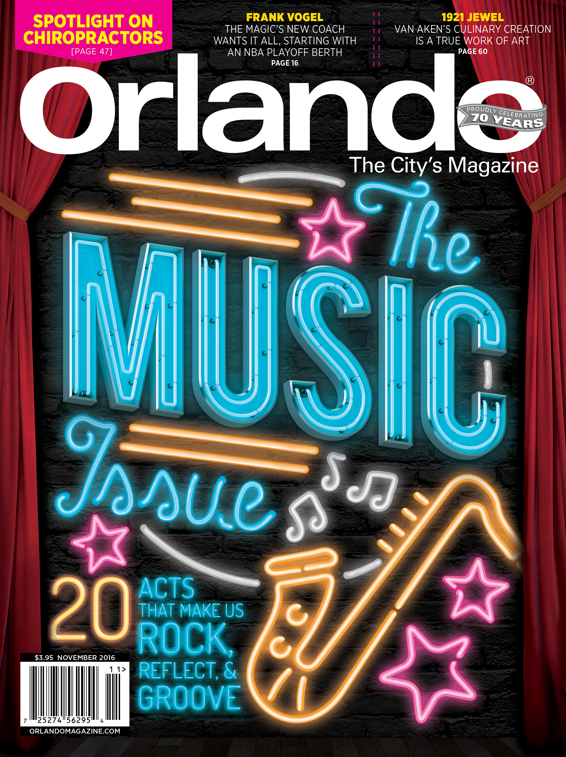
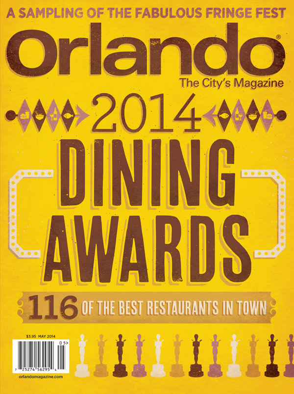
I also love working with other talented individuals. For instance, commissioning a 3D-printed dining awards statue, collaborating with an illustrator to add some flair, or working closely with a food stylist.
FEATURES + OPENING SPREADS
As Art Director, I designed the main features in addition to the cover. On opening spreads, I always tried to create compelling typography and imagery, sometimes very simple and clean, and other time more playful and ornate.
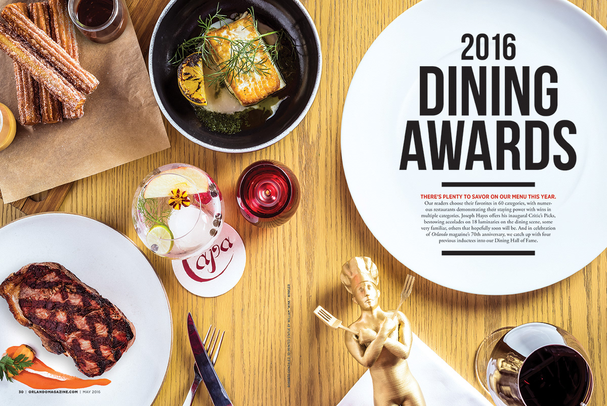
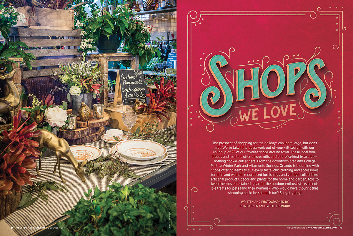
I frequently worked with illustrators as well, coordinating the art direction and refining the execution of the final designs.
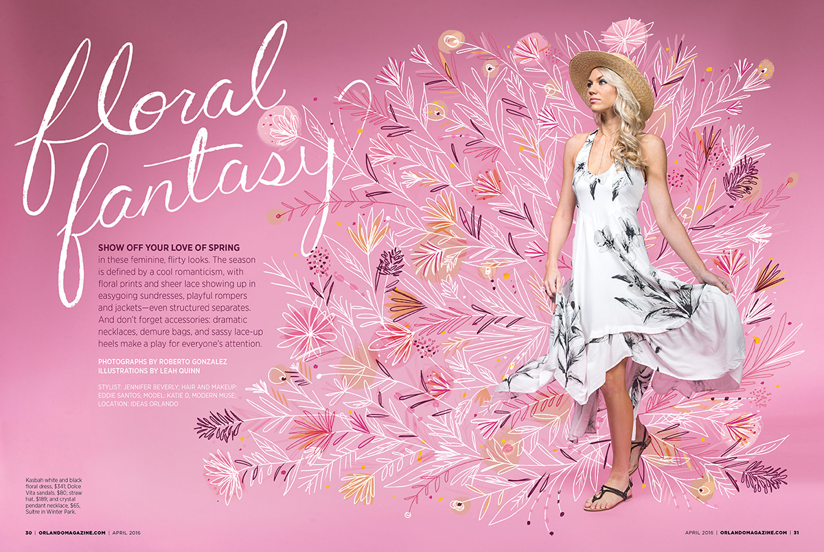
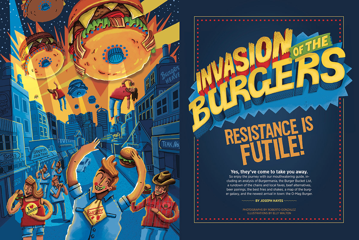
Feature articles varied in length, sometimes 20 pages or more, and required a variety of different strategies in order to create a great reading experience. Some stories were more text heavy and narrative-driven, and required a clean grid for easy reading, while breaking up the monotony of text with interesting call-outs, pull quotes, or other bits.
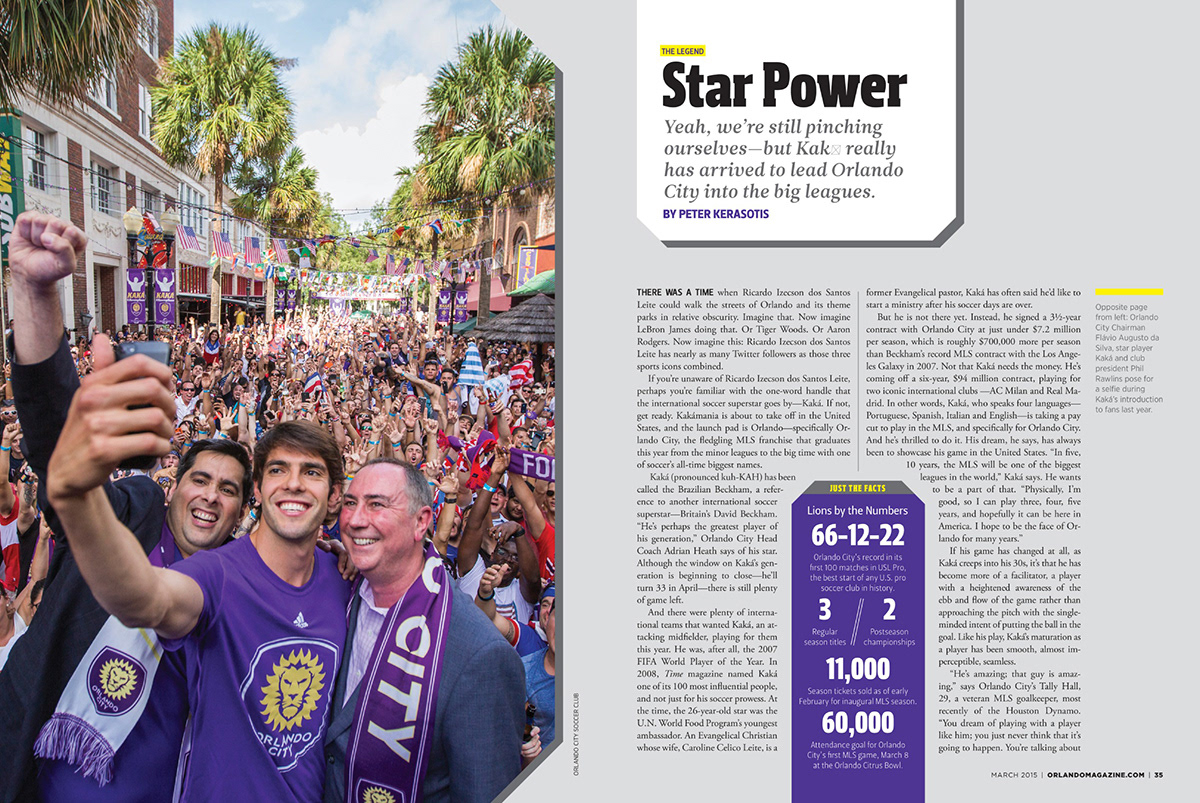
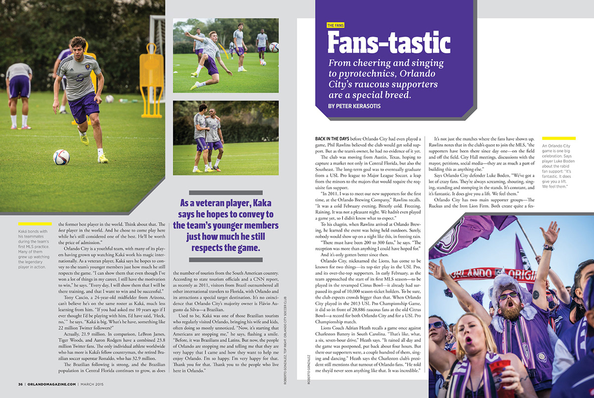
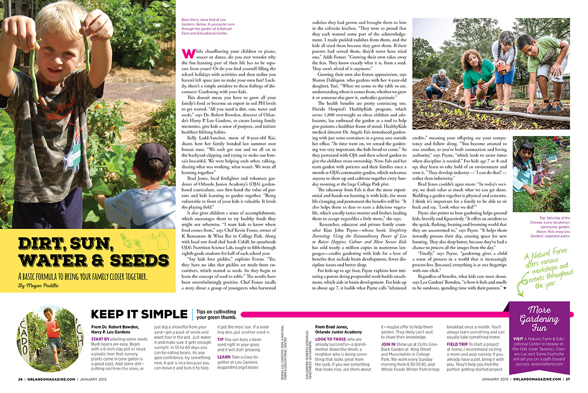
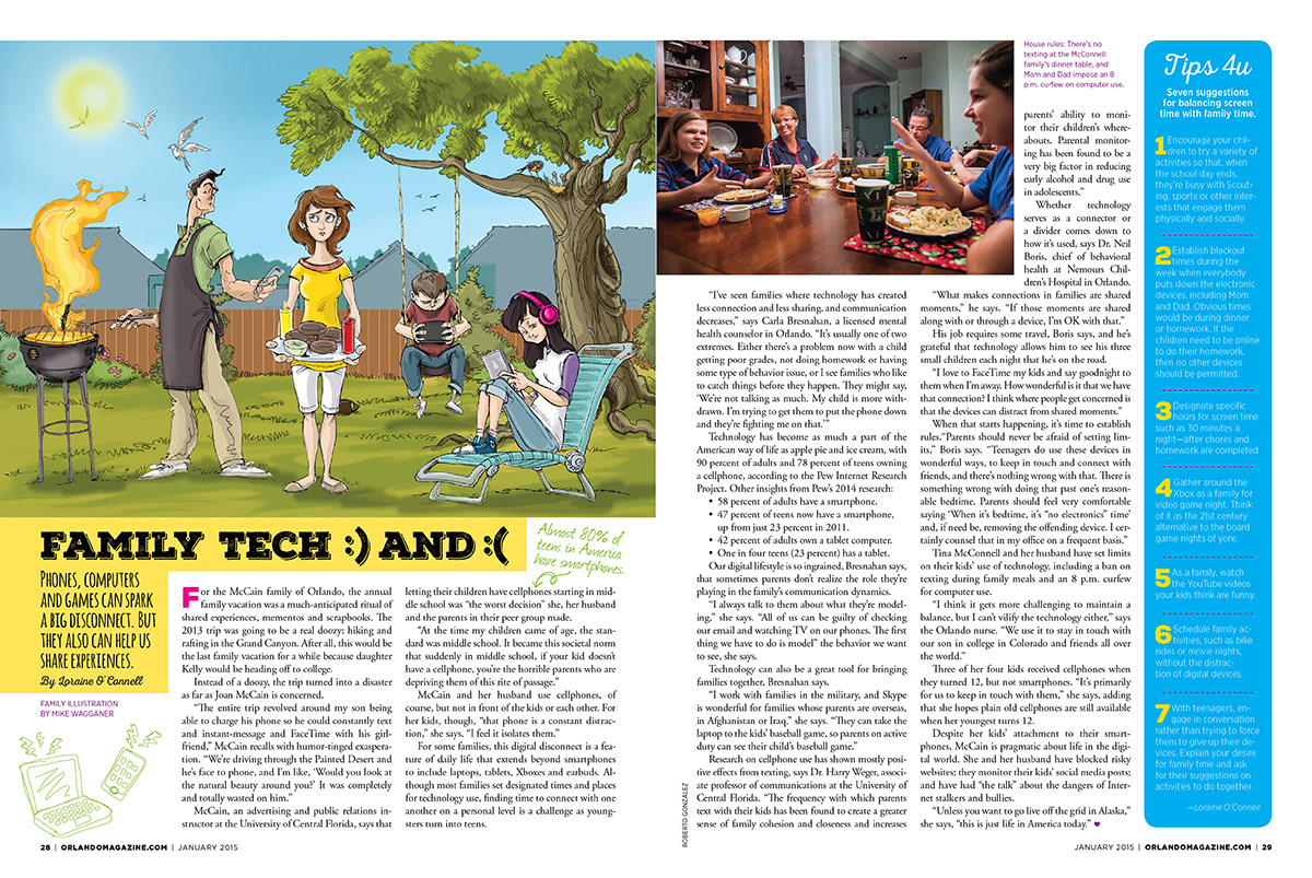
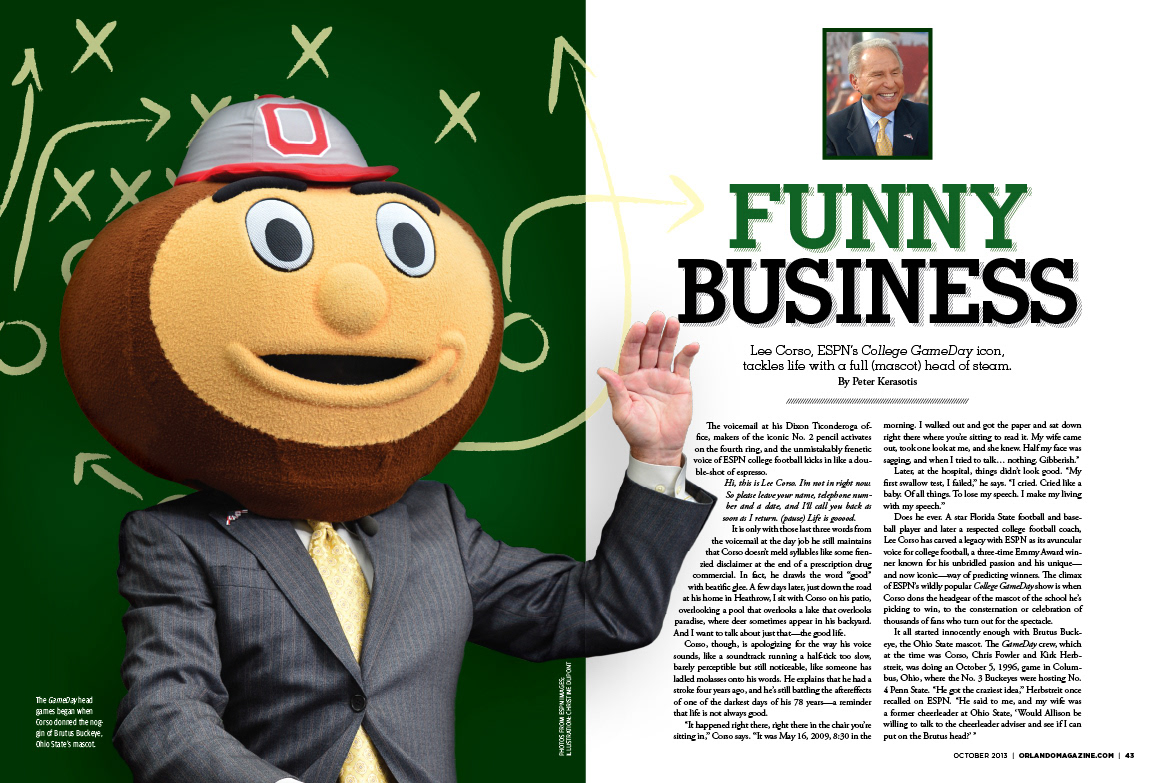
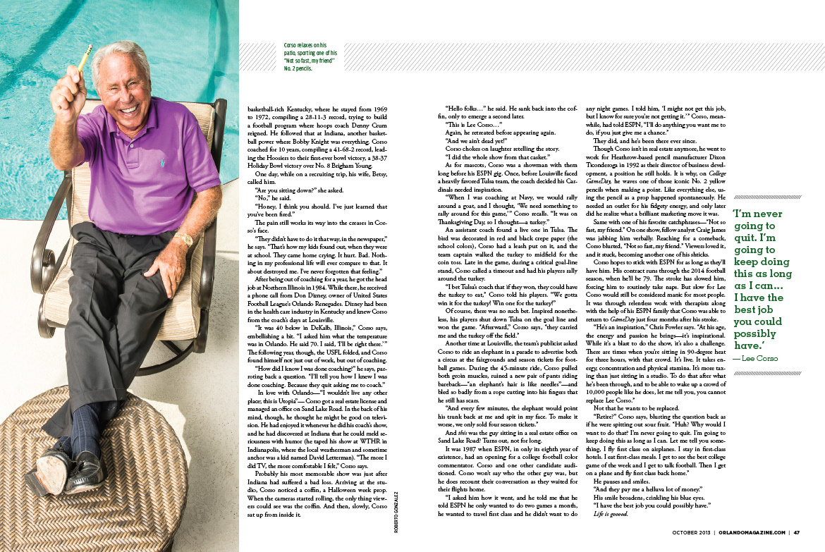
Many of the features we did consisted of a number of shorter stories, lists and call-outs, which required a more modular and gridded approach to the layout. They were often like a puzzle and I enjoyed the challenging of putting them together.
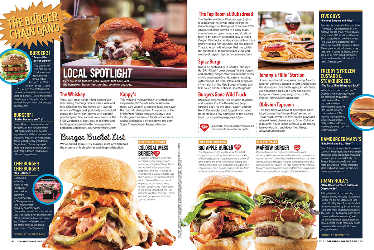
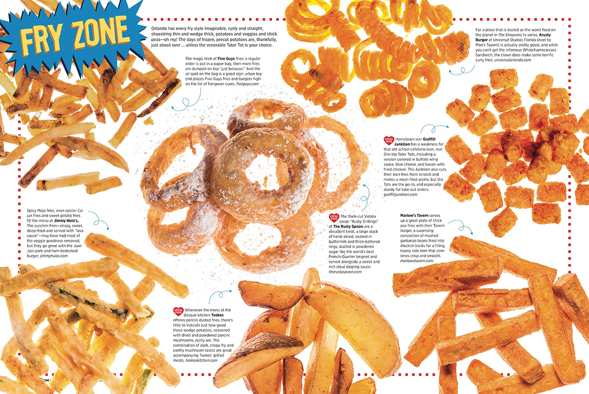
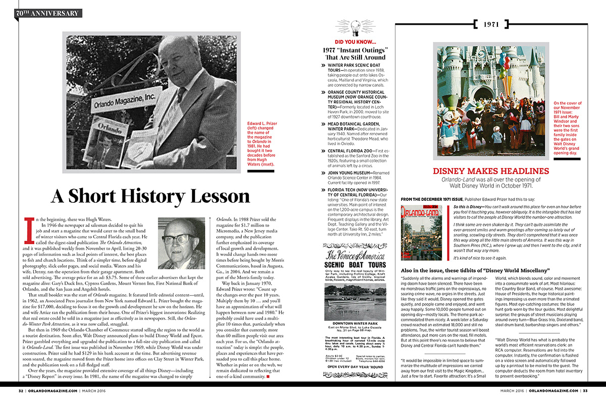
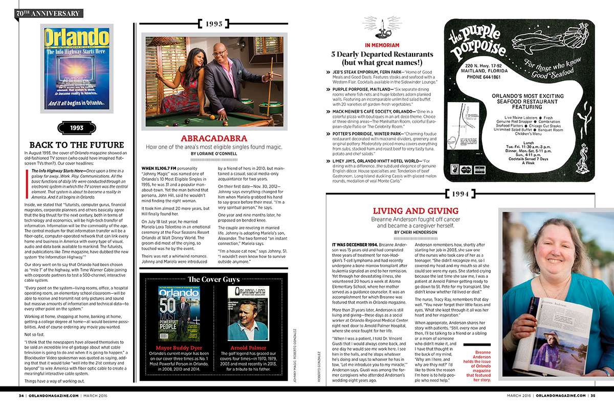
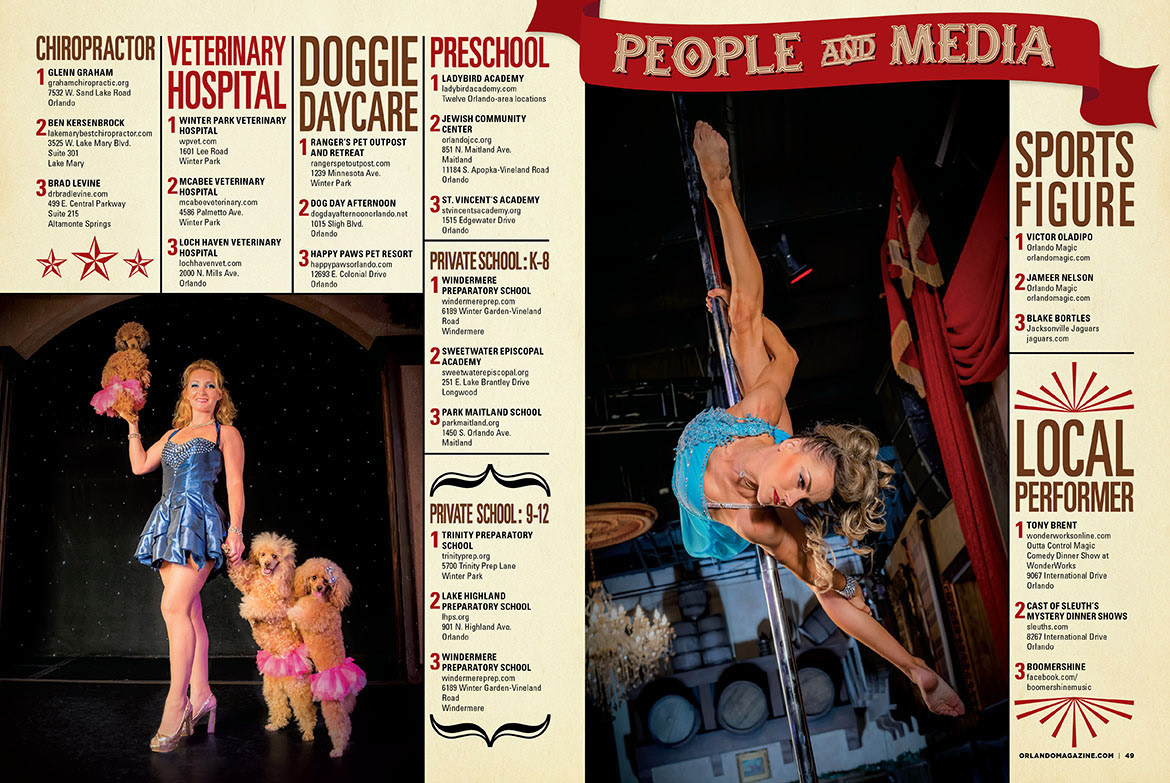
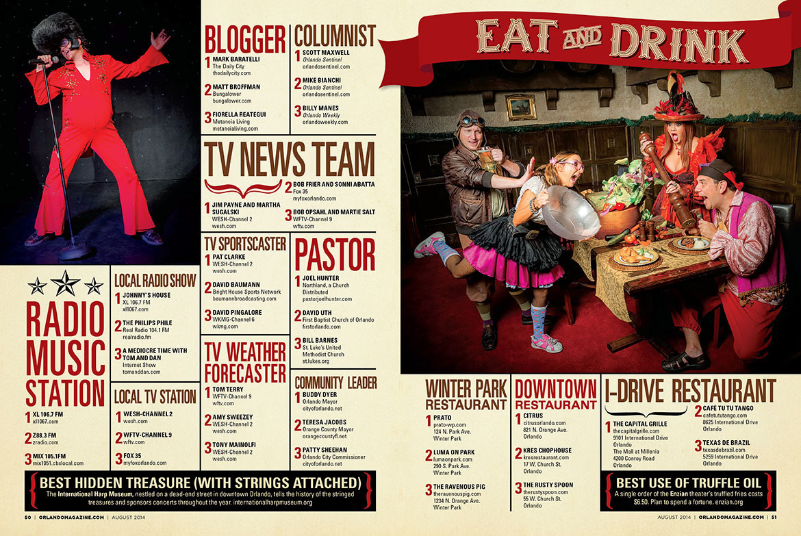
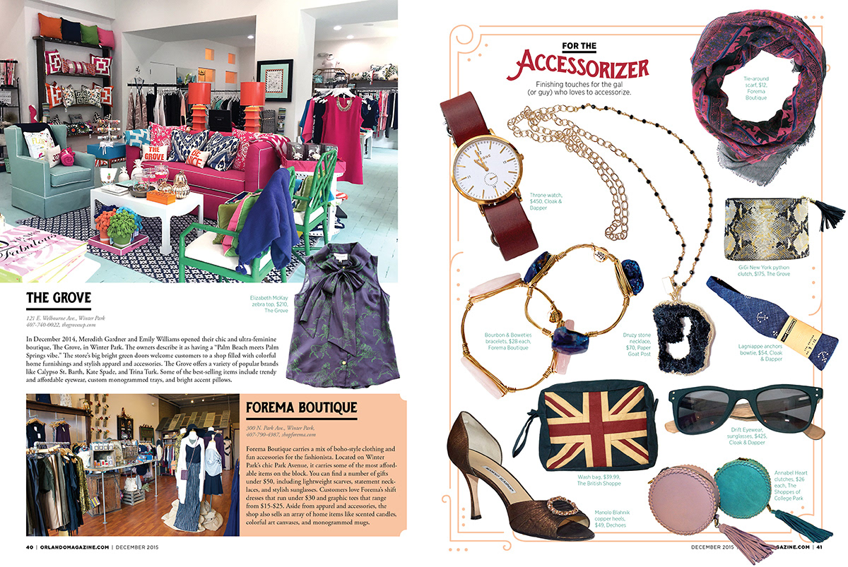
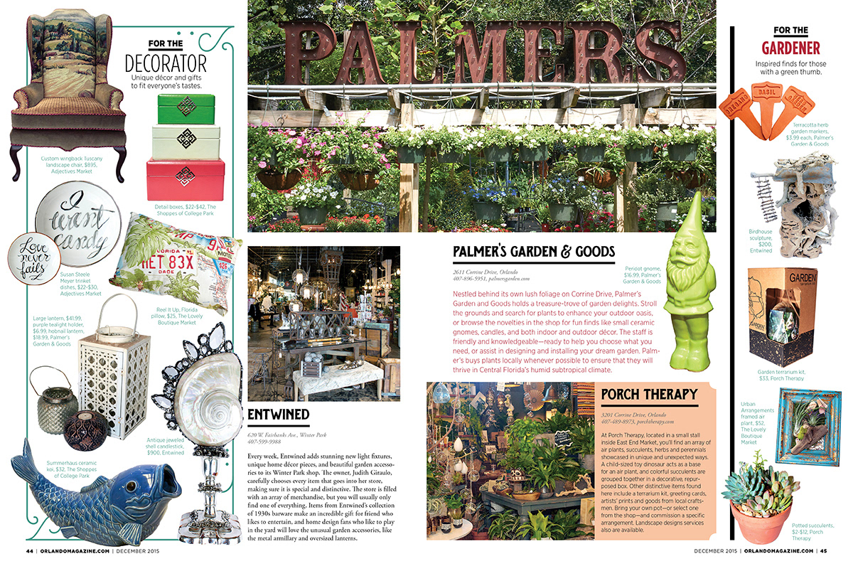
DEPARTMENTS + OTHER ARTICLES
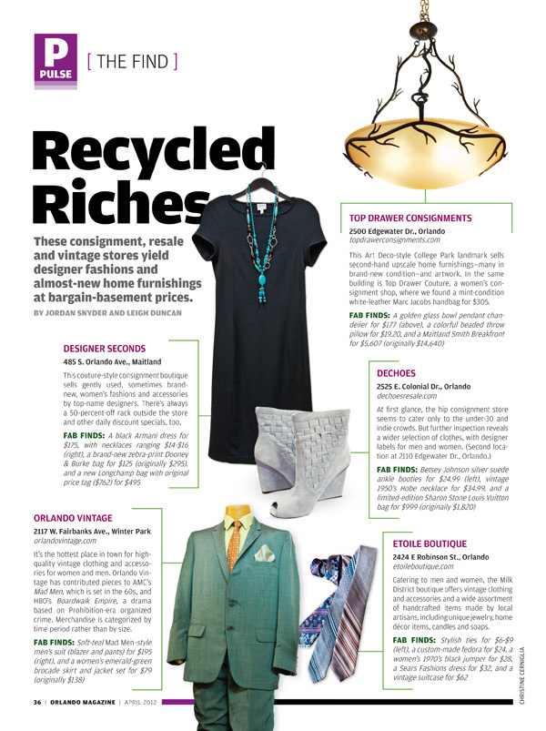
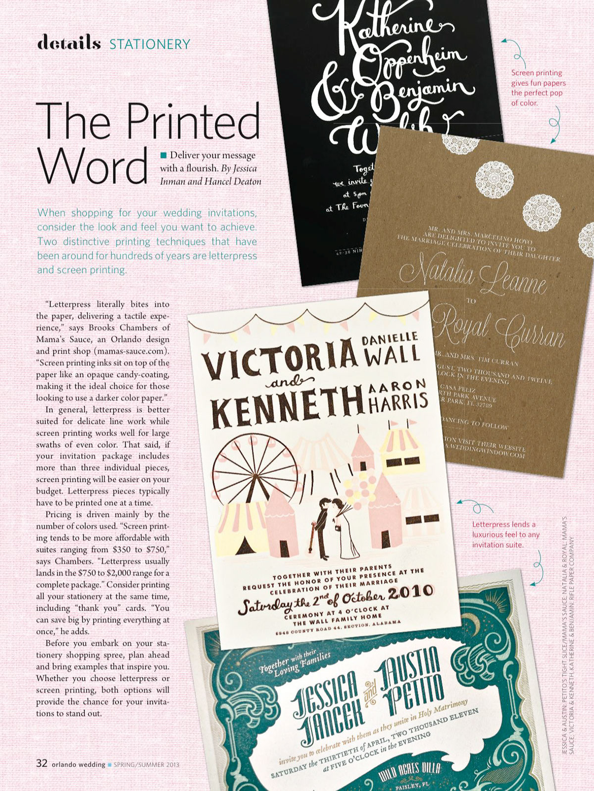
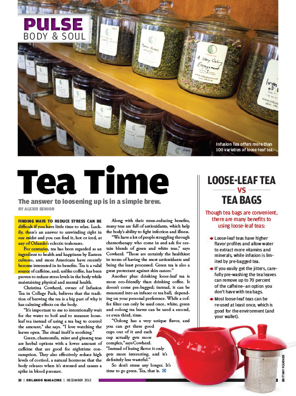
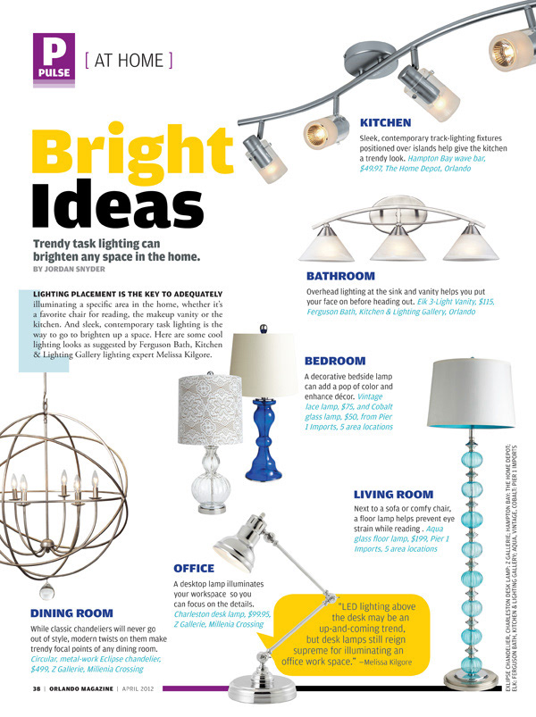
The front of book and back of book consisted of a variety of different articles, from short stories to product pages to event and restaurant listings. These sections have gone through a few redesigns over the years, but the templates and overall stylistic approach I created can be seen in this flip-through here.
