
The original look of Lush Cosmetics. Image © Lush Cosmetics.
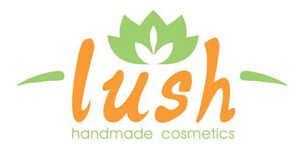
New logo... completely different feel and approach.
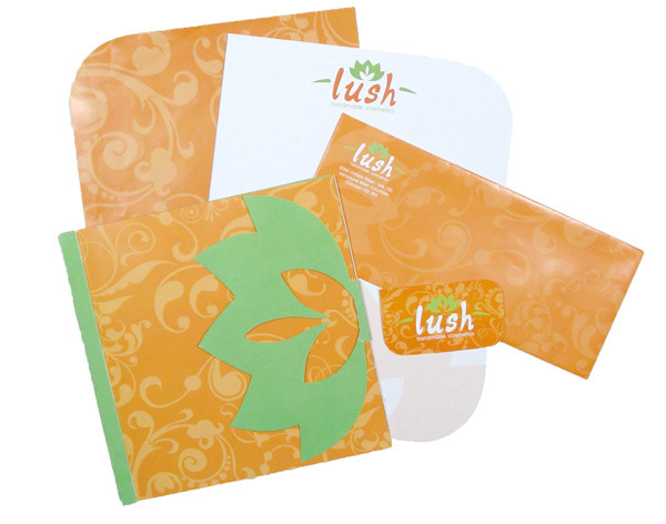
Print collateral. Letterhead, envelope, business card, and style guide.
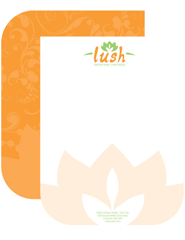
Die cut, doublesided letterhead.

Envelope with liner.
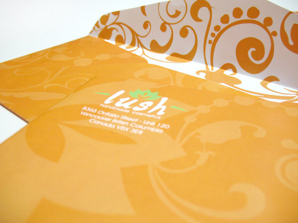
Close up of envelope.

Double sided, die cut business card.
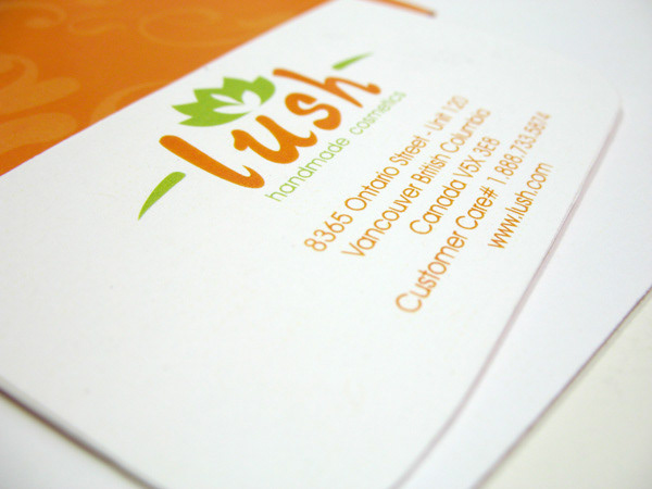
Back of die cut, double sided business card.
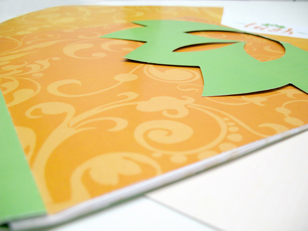
Style guide. Multi-page booklet featuring hidden side stitching and die cut flap.
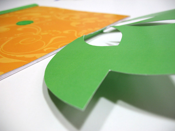
Close up of die cut flap.
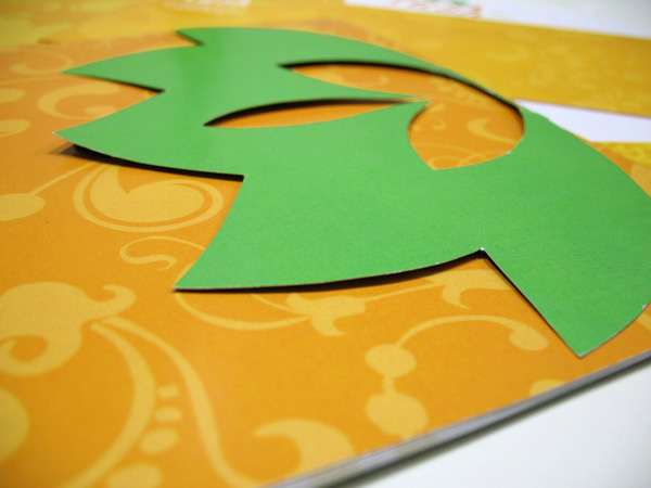
Close up of die cut flap opened. Sealed with velcro.
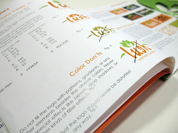
Close up of interior pages, detailing the do's and don'ts of using the Lush logo.
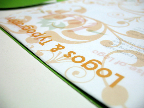
Section title pages printed on vellum.

BIllboard concept indicating that their products are made by hand.
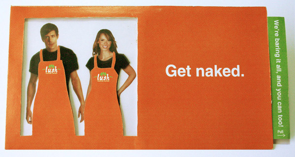
Interactive direct mail piece for their event "The Naked Truth".
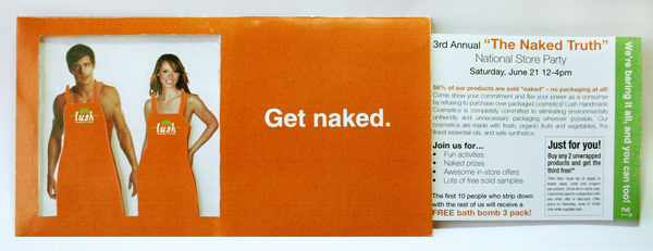
Interactive direct mail piece for their event "The Naked Truth". When pulled, it gave the illusion that the two model had their clothes removed. This is a real event where the store clerks walk around in nothing but their aprons.
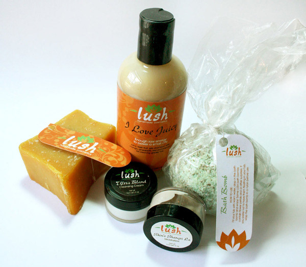
Product packaging, kept minimal to stick to their company standards.
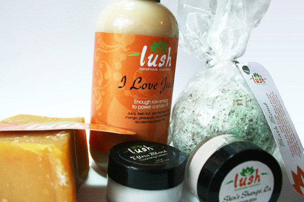
Product packaging included bottle label, circular container labels, and die cut hang tags.
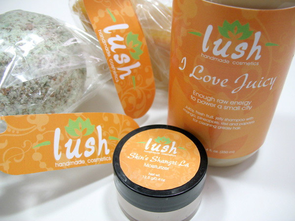
Another shot of of some of the products, featuring an additional orange circular label design. Bath bombs and soaps were placed into cellophane bags and tied with a corresponding hang tag.
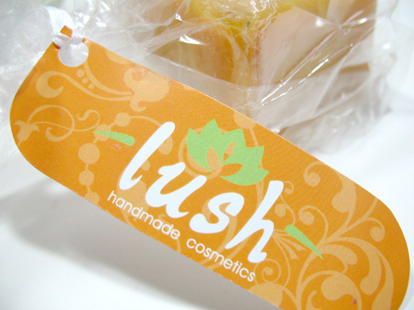
Close up of hang tag. Each hang tag featured instructions on the back, detailing how to use a specific product.
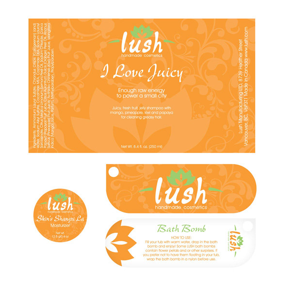
Flat view of product packaging.